Form with Mobile Responsiveness: Applications now have adapted to mobile environments, so the user can access their applications directly from your tablet or smartphone independent of the size of the device screen used to access the application Scriptcase always display the contents of the friendly form.
When a form application is created on Scriptcase, automatically, two different folders are also created, one with source code for the desktop form and the second one with the source code for the mobile form, and then, when the applications is being accessed by an end user, Scriptcase will identify what device it is and will redirect the end user to the best form, either mobile or desktop.
In this sample we will show how to set up a different toolbar buttons for your mobile application.
| 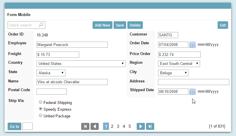 |
| 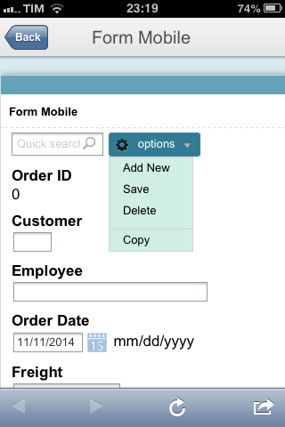 | ||||||||||||||||||||||||||||||||||
 | |||||||||||||||||||||||||||||||||||||
 | |||||||||||||||||||||||||||||||||||||
| Form running on a Desktop | Form running on a Smartphone |
Selecting buttons to show on the mobile application
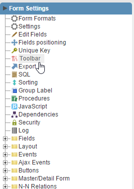
1. Open a Form application and go to the “Toolbar” item in the application menu
 | ||
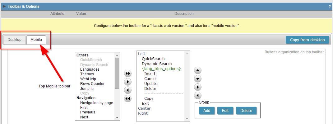
2. The toolbar of the application is divided into two guides: Desktop and Mobile, so it is possible to define which buttons will be displayed on each device type.
 | ||
Click the button below to view the application running.
Form with Mobile Responsiveness Example
Check out more content on our blog!
Learn all about Scriptcase.

You might also like…